Summary: This blog explores everything from A to Z about what is Google Data Studio Or Looker Studio, how it proves beneficial, and, most importantly, how to use Data Studio to create a report. Additionally, learn how it can help check SEO performance.
Did you know? Presently, over 9,400 companies use Data Studio or Google Looker Studio (its updated name) for data visualization! But why? What makes Google Studio such a well-loved tool? Simply put, it doesn’t require extensive expertise, and once you know how to use it, you’ll quickly be able to create impressive reports that stand out. Plus, its amazing features—like customizable templates, data visualization, and data blending—make it even more powerful and versatile.
Moreover, Google’s Data Studio brings together Google Analytics and Google Ads, simplifying your reporting process and, ultimately, making it super easy to track and visualize everything in one place.
What is Google Data Studio OR Looker Studio?
Google Data Studio is a free tool that helps users, especially marketers and business owners, turn data into easy-to-understand reports and visual dashboards. Your team can save time and money with Data Studio because it only takes minutes to make, read, and share reports. As a result, Data Studio helps your business and team make decisions faster and get better results because it is easy to use and can do several things.
Additionally, reporting software can be very expensive, which can hurt your bottom line. However, Google keeps meeting the needs of individuals by providing a free way to report data.
Key Features of Google Data Studio OR Looker Studio
To understand why so many people are switching to Google Studio or Looker Studio, let’s look at some of its standout features:
Multiple Data Source Integration
Data Studio allows you to import data from many sources—Google Ads, Analytics, YouTube, Sheets, and even databases like MySQL or BigQuery. Therefore, one view with flawless integration will show all necessary data.
Interactive and Customizable Visuals
Users can showcase data in a way that makes sense to their audience with this tool’s different chart types, such as bar charts, pie charts, line graphs, tables, and more. It’s easy to change the way images look with interactive tools like filters and date range choices.
Real-Time Data Refresh
Unlike static reporting, Google Data Studio automatically updates reports with the latest data from connected sources. This is ideal for real-time insights, especially in dynamic industries where numbers change frequently.
Collaboration and Sharing
Visualization Studio allows you to share reports with others easily. You may set permissions to enable particular people to see, modify, or comment. Also, shared reports are live, which means that any changes to the data will be available to all viewers in real-time.
Fully Customizable Design
Tailor your reports to reflect your business or personal style. To make reports seem distinctive and on-brand, you may customize colors, fonts, and layouts, as well as include your logo.
What are the Benefits of Using Data Studio?
Among the many advantages of Data Studio, here are the primary ones:
1. Access a wide variety of widgets
Google Data Studio enables you to add infinite widgets, unlike Google Analytics, which restricts reports to 12 charts. This adaptability lets you publish data in several formats: heat maps by area, pie charts, time series graphs, and more. Different measurements allow each widget to be tailored, enabling more data display and report design. Because of its adaptability, Data Studio is an excellent solution for companies trying to produce more dynamic, instructive reports.
2. Connect Data from Various sources
One of Google Data Studio’s most potent abilities is gathering data from up to 12 sources in one report. To produce thorough reports covering all aspects of your company, you can easily mix data from Google Analytics, Google Ads, YouTube, CloudSQL, Search Console, and more. Thus, this feature makes Visualization Studio a powerful, all-in-one reporting tool. Thus, you can showcase the value of digital marketing with professional, aggregated reports—all for free—to decision-makers.

3. Share Data Studio reports effortlessly
With its similar sharing capabilities as Google Docs, Google Looker Studio simplifies teamwork. You can share a link to your report instead of files so team members, account managers, or decision-makers may quickly access and change it. Moreover, changes occur in real-time. Hence, everyone views them as they take place.
4. Make reports that are easy for anyone to understand
Google Data Studio provides the freedom to produce reports of any length—from one page to several pages—that fit the demands of your business. From fonts and colors to themes and widget layouts, perfect every element to ensure your report is aesthetically pleasing. Moreover, each page allows you to add up to 10 widgets, giving team members and decision-makers both a whole picture.
5. Add interactive features to enhance user engagement
You cannot use only one dimension in your charts and graphs. Distribute your reports digitally so company executives can easily select the necessary information. Users may easily see data with this interactive feature.
6. Use free templates in Data Studio
Google Insights Studio provides ready-made templates for those unfamiliar with Google Analytics or reporting to simplify report creation. The platform comes prepackaged with templates for Google Analytics, YouTube, Google Ads, and many more services. It even comes with layouts for specialized businesses, such as ecommerce.
Ultimate Guide: How to Use Google Data Studio OR Looker Studio?
1. Log In/Sign In
Visit Google Data Studio or Looker Studio and sign in with your Google Analytics, Google Ads, or Search Console account details.
Once logged in, you’ll see the main overview page. To access your dashboard, select the “Home” tab.
2. Explore the Data Studio Dashboard
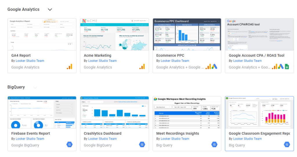
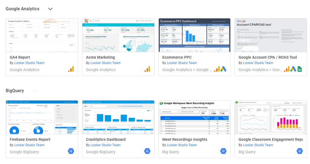
The example image below shows what sample reports look like and highlights the types of insights you can gather from your custom reports.

3. Reports and Data Sources
As shown above, you will find data sources and reports on the Data Studio Dashboard. Clear data visualizations made possible by reports help you to grasp your data. In the meantime, data sources serve as connectors, tying your report to outside information such as Google Analytics or Google Ads.
4. Link Your First Data Source
Data sources are the bridge between a Data Studio report and your raw data. Additionally, each data source comes with specific features and pre-built connectors, making it simple to connect and pull in the data you need.
With over 500 supported data sources, you have many options to choose from. Also, some of the most popular ones include:
- Google Analytics
- Google Ads
- Google Search Console
- BigQuery
- YouTube Analytics
- PostgreSQL
- Search Ads 360
How to Create a Report on Google Data Studio OR Looker Studio?
Follow these simple steps to create a report that stands out:
Step 1: Choose a Data Source
Click “Create,” then choose “Data Source.” Here, you choose the platform from which to retrieve the data. For well-known sources such as Google Analytics, Ads, YouTube, Sheets, and even outside choices, including MySQL, BigQuery, and more, Google provides a vast array of connections.
- Choose your preferred data source.
- Turn on any important permissions.
- After linking, your data source will appear, and you can begin creating.
Step 2: Create a Blank Report or Use a Template
Google Data Visualization tool offers the ability to start from nothing or use a pre-made framework.
- Templates let you save time and inspire layout and design.
- Visit the Template Gallery and peruse possibilities for using a template.
- Remember that the templates you may personalize come pre-built with layouts, charts, and widgets.
- Lastly, choosing an empty report gives you ultimate creative control over every component.
Step 3: Customize Your Report Layout
It’s time for creativity; now you are the editor. Key customization options are:
Add Charts and Tables: Click the “Add a Chart” option to select from several graphics, including bar charts, pie charts, scorecards, etc.
Drag and Drop Fields: Every data source you link contains fields like “Page Views” or “Click-Through Rate.” Bring these fields into your selected chart.
Apply Filters: Filters let people access certain data subsets. You may apply a filter, for instance, to examine just the data from a given date period.
Step 4: Style Your Report
Styling allows you to match the report with your branding. Therefore, to create a unified report, adjust fonts, colors, and borders.
- To alter the general color scheme, see the “theme and layout” page.
- Add logos and images if you are writing a report for a customer using their brand colors.
- Select a somewhat aesthetically pleasing font type. Additionally, maintaining a limited font type will make the report more professional.
Step 5: Add Interactive Elements
Interactive components add interest and user-friendliness to reports. As a result, you might incorporate these components:
- Let viewers choose the date range they wish to investigate.
- Dropdown menus let consumers view the data they find relevant for things like area, product category, or campaign.
- Users may click on particular data points to access further information, including a breakdown of a given category.
Step 6: Review and Share Your Report
After creating your report, carefully review it to ensure the accuracy of the data. Lastly, when you are ready to share:
- Click “Share” at the top of the page.
- Select rights for every visitor so they may see, change, or remark.
- For immediate access, forward the URL to clients or team members.
How to Use Google Data Studio to Monitor SEO Performance?
As a digital marketing firm, we use Google Data Studio to improve our digital marketing services. Specifically, it gives us useful information about how SEO is working and how our competitors are planning their campaigns.
Furthermore, Google Studio helps you monitor the following SEO practices, but its capabilities extend beyond these:
- Check your website traffic – The traffic on a website is essential to understand how well your site is performing. Moreover, Data Studio helps with this by tracking the number of visitors and analyzing their behavior, showing which pages they visit most and how they interact with your content.
- Keep track of where your keywords ran – You have to access your keyword results by connecting to your Google Search Console account. Once you’ve done so, you may generate a customized report displaying your main search terms, keywords’ position, average number of searches per month for each keyword, and more.
- Watch your backlinks and how anchor texts are used – Google Data Studio may assist you in grasping the distribution of your anchor text and the source of links on your website. However, you must link to your Google Search Console account to accomplish this.
- Review your competitors’ SEO strategies – For competition analysis, Google Reporting Studio is a great tool that lets you view competitor rankings, target keyword performance, and source links. Additionally, connecting your Google Search Console provides data showcasing top competing sites, keyword placements, search volumes, and backlink comparisons.
Also read:
Google Rolls Out November 2024 Core Algorithm Update
Professional Website Design Services in Melbourne – Elevate Your Brand
Top 10 Industries Using Google Ads for Lead Gen
Final Thoughts
Companies trying to perform data reporting and visualization will find great value in Google Data Studio. This tool is helpful for data-driven decision-making by aggregating several data sources into one simple display. Furthermore, the interactive tools and customization let you easily fit every report to your requirements, therefore facilitating clear and efficient communication of ideas.
If you are ready to improve your data reporting, spend some time exploring Visualization Studio and begin creating your first report. With minimal effort, you will quickly discover how this tool can transform your perspective on data sharing.

Sarabjeet Singh is the Vice President of Operations at Tech2Globe and brings over 15 years of experience in various industries, including IoT, education, retail, government, FMCG, hospitality, and e-commerce. His leadership focuses on operational excellence and exceeding customer expectations, implementing contemporary solutions. Sarabjeet’s expertise spans e-commerce consulting, software development, data management, BPO/KPO support services, digital marketing, graphics, and startup consulting. He fosters a collaborative work environment, ensuring Tech2Globe delivers high-quality solutions.


